
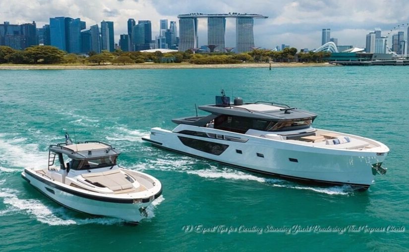
A great marine visualization does more than show a vessel from flattering angles. It sells confidence. Clients need to see craftsmanship, proportion, atmosphere, and intent in a single glance. Top companies such as Inna 3D treat presentation work as part design communication, part sales strategy, and part visual storytelling. A polished yacht rendering can help a concept feel tangible long before construction begins.
That first impression carries real weight. Owners, brokers, shipyards, and investors often react to mood and clarity before they react to technical data. A strong image can make a proposal feel premium, organized, and ready for the next step. A weak one can make a smart design feel unfinished. The difference usually comes down to choices that look small on screen but matter a lot in the final frame.
Start With Design Intent, Not Software Tricks
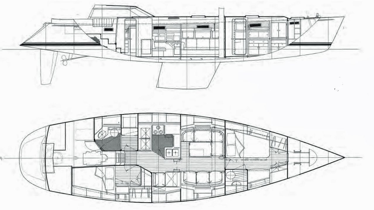
Tip 1: Build each image around a clear client goal. Before placing a camera, define what the client needs to feel after viewing the render. One scene may need to sell elegance and quiet luxury. Another may need to prove deck usability, guest flow, or commanding exterior presence. That goal should shape every decision that follows, from framing to weather to material contrast. When artists skip this step, the result often looks technically strong but emotionally flat. Clients notice that gap fast.
Tip 2: Choose angles that reveal hierarchy and proportion. Many yacht visuals fail because they chase drama without explaining the design. A low, aggressive angle can look impressive, but it can also distort the sheer line, overpower the superstructure, or hide a beautifully resolved aft deck. Use hero views with purpose, then support them with clean side perspectives, elevated three-quarter shots, and selective close-ups that highlight the details clients care about most. A rendering should answer questions before the client asks them.
Make Materials Feel Expensive and Believable
Tip 3: Treat materials as the core of realism. Physically based rendering workflows are designed to produce a more accurate representation of how light interacts with material properties, and they help artists create more consistent results across scenes and lighting setups. Adobe’s guidance also notes that rougher surfaces create broader, dimmer highlights, while smoother surfaces keep reflections tighter and brighter. That matters on yachts, where paint, glass, stainless steel, teak, and water all respond to light in visibly different ways.
Tip 4: Push past generic white surfaces. “White yacht” does not mean one flat white shader. Hull paint, gelcoat, satin trim, powder-coated metals, polished rails, leather upholstery, and sunlit composites all need their own response to light. Small differences in roughness, reflectivity, edge wear, and microtexture create the richness clients read as quality. The same rule applies to wood. Teak should show subtle grain, weathering control, and believable scale. If every surface looks equally clean and equally glossy, the vessel starts to feel synthetic.
Use Light To Shape Luxury
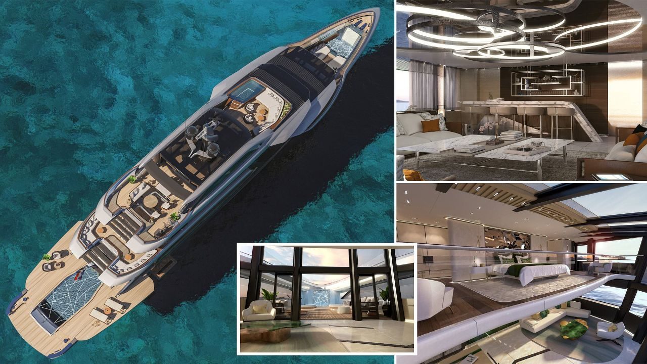
Tip 5: Build lighting as if you were shooting a real campaign. Dome-light and HDRI-based setups remain useful because a V-Ray Dome Light is designed to illuminate the scene as if light is coming from a spherical or hemispherical source outside it. That gives artists a reliable base for natural environment lighting. From there, refine the scene with sun direction, bounce, reflections, and controlled accents rather than blasting the model with bright fill. Good yacht imagery needs shape, not flat exposure.
Tip 6: Pick the time of day that flatters the design. Midday light can work for technical clarity, but it often kills mood and makes white hulls harder to read. Early morning or late afternoon usually gives you better form, richer reflections, and softer transitions across the superstructure. Blue hour can work beautifully for exterior hospitality scenes, especially when interior lighting adds warmth through glazing. The key is control. Light should lead the eye toward the best design decisions and create a premium feeling without turning the render into a cliché postcard.
Control the Camera Like a Photographer
Tip 7: Compose with restraint. Real yacht photography rarely relies on extreme wide-angle distortion unless the goal is pure spectacle. Clients looking at design proposals usually respond better to measured focal lengths, clean horizon placement, and balanced verticals. A camera that sits too low or too close can make the bow look oversized and the rest of the vessel feel compressed. That may create short-term drama, but it can also misrepresent the design. Use composition to create authority, not gimmicks.
Tip 8: Use depth of field and exposure with discipline. Chaos documentation for the V-Ray Physical Camera notes that depth of field must be enabled intentionally, and camera settings also support exposure control. In practice, that means shallow focus should be a deliberate storytelling tool, not a default effect. A close-up of polished hardware, a helm station, or a custom lounge detail can benefit from selective focus. A full exterior hero image usually needs more clarity across the frame. The same goes for exposure. Protect highlights on white surfaces, keep interior glows believable, and avoid crushing shadows into muddy black.
Refine Color, Reflection, and Water With Precision
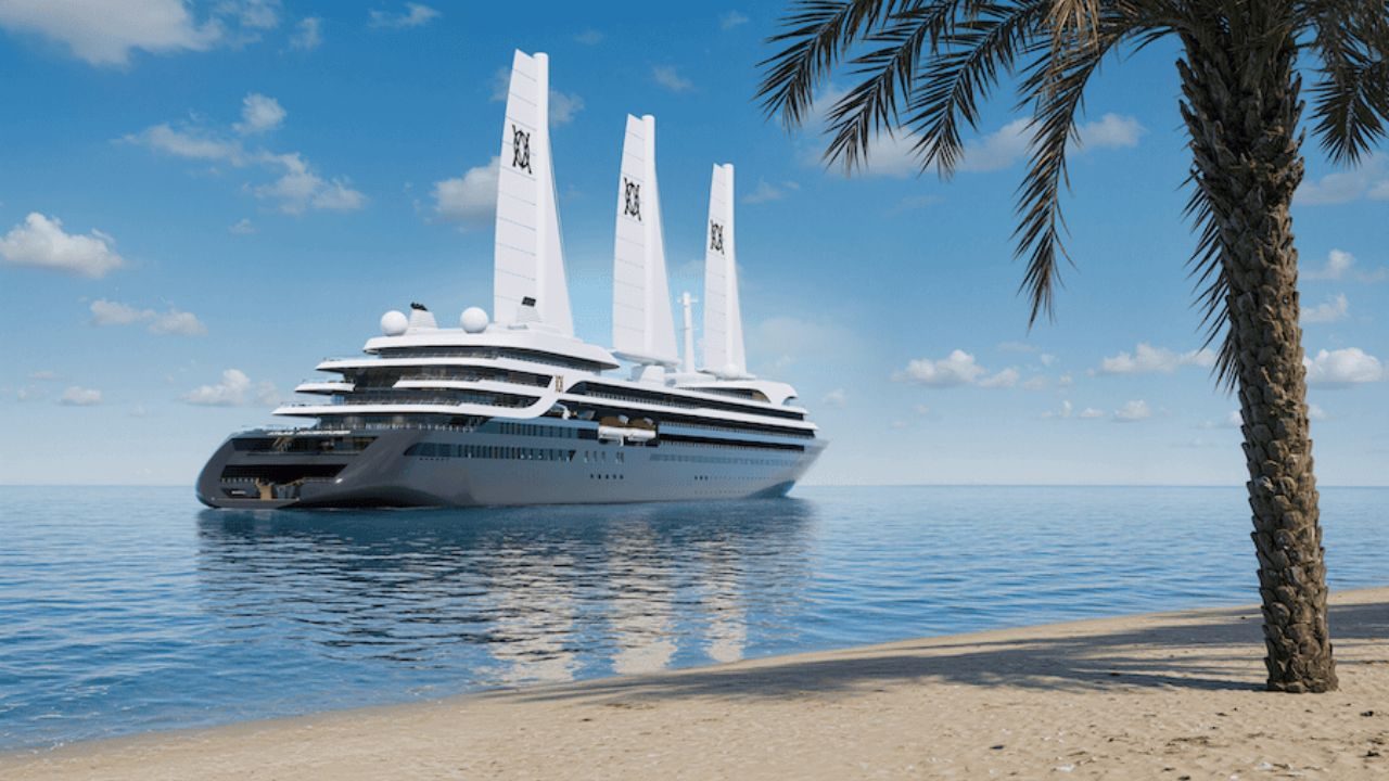
Tip 9: Build a color pipeline that stays consistent from look development to final output. Autodesk states that 3ds Max’s OCIO-based color management uses scene-linear rendering spaces, and newer releases made OpenColorIO the default mode for new scenes. That shift matters because yacht visuals depend on subtle whites, soft sky gradients, deep marine blues, and reflective metals that can break apart when color handling gets sloppy. A disciplined pipeline helps keep materials stable across monitors, review files, and final exports.
Water deserves the same care. Poor water instantly exposes weak marine CGI. The sea should support the vessel, not steal attention from it. Match wave scale to yacht size. Control roughness so reflections feel plausible. Watch the contact line where the hull meets water. Even a nearly calm surface needs variation, depth, and a touch of imperfection. The strongest artists treat water as part of the product shot. They do not drop the vessel onto a stock-looking ocean and call it finished.
Present Options That Help Clients Say Yes
Tip 10: Show polished choices, not endless possibilities. Clients love customization, but they do not want confusion. Present a focused set of variants for hull color, upholstery mood, deck staging, lighting scheme, or marina context. Interactive tools can help here. Epic’s Twinmotion documentation says configurations can be used to create interactive presentations that show different variations of a project, and Unreal Engine’s Path Tracer is described as a progressive, hardware-accelerated mode for high-quality final output. Real-time systems like Lumen also use multiple ray-tracing methods for global illumination and reflections, which makes them useful during look development and review. Used well, these tools help teams compare options quickly without losing visual quality.
Finish strong with an edit, not just a render. V-Ray’s render elements can separate diffuse color, reflections, shadows, mattes, and other components, which gives artists more control in compositing and final polish. That is valuable because client-facing visuals rarely succeed on raw output alone. Fine-tune contrast. Clean the whites. Sharpen focal areas. Remove distractions. Then review every frame from the client’s point of view. Does the image feel premium? Does it explain the design quickly? Does it look like something worth buying, building, or approving? If the answer is yes, the rendering has done its job.